

Page Revisions:
(March 22, 2026) Original
(June 21, 2026) New Trailer (#2) — New Posters (#1-#13)
(July 26, 2026) New Trailer (#3) — New Posters (#14-#19)
Release Date:
July 31, 2026
Synopsis:
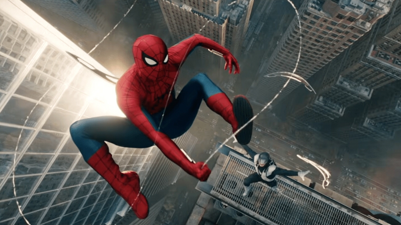
From IMDb: “Peter Parker tries to focus on college and leave Spider-Man behind. But when a new threat endangers his friends, he must break his promise and suit up again, teaming with an unexpected ally to protect those he loves.”
Poster Rating: C+ / C / C / C+ / B / C+ / C+ (6) / C+ / B- / C / C+ / C / C / B
SEE ALL POSTERS BELOW
Review: (#1, C+) The one threat he tried to avoid is in his mind’s eye again. A fitting throwback to prior films. (#2, C) Spider-Man vs. The Hand and nothing of visual splendor to see. (#3, C) Reminiscent of Superman’s costume beneath street clothes look, this close-up is underwhelming at best. (#4, C+) Taking that prior design and adding over it does improve the effort but not by much. At least the addition is visually interesting. (#5, B) There’s always a choice with these hand-drawn comic-styled efforts that stands out in a crowded marketplace and shows how a big film can do better than it has with its other advertising dross. (#6, C+) The reflection is meant to be discolored because of the sun’s reflection off-screen but it doesn’t even look like the same costume (which could be a spoiler). (#7-#12, C+) A standard array of format designs that fail to raise any bars. (#13, C+) An attempt at something new but with only three colors is difficult to look at without wondering if they could have tried something a bit more interesting.
(#14, B-) Not likely a scene from the film, the manipulated feel overcomes the reflective concept of the design. (#15, C) Familiar and under whelming. This looks more like a poster for a video game than a movie. (#16, C+) The enemies are arranged and that carries a lot of thematic weight but the background is underwhelming while the art is indistinct in places and fake-looking in others. (#17, C) Another reflective design, a thematic concept this series of films have overused. There’s simply not enough here to engage (#18, C) Another dull effort with cheap-looking veneer. (#19, B) That white background is a travesty but the content is solid, generally well balanced, and setting specific. It does however pain the picture of a film that has too many villains.
Trailer Rating: C+ / B- / B-
SEE ALL TRAILERS BELOW
Review: (#1, C+) If you haven’t seen the second film, this will likely give away that one’s entire plot but if you were already interested in the series, you probably have seen it and anyone else is probably going to ignore it. As a fan-only strategy, it’s a solid first trailer though the frustration of having people forget you isn’t well handled with scenes that shift between that theme and his metamorphosis plot are poorly integrated and almost feel like two movies haphazardly edited together.
(#2, B-) The most details about the plot we’ve gotten so far does make it seem like a more exciting installment but you can see the character creep going on with the standard Spider-Man characters plus The Punisher, Hulk, The Hand, and what appears to be at least two villains. Overstuffed is definitely a concern.
(#3, B-) The prior trailers hinted a bit at this but this full effort does a slightly better job conveying the various plot elements that are running through the film. Unfortunately, it also feels like there’s too much going on.
Oscar Prospects:
None.
Trailer #1
Trailer #2
Trailer #3
Posters
 Poster #1
 Poster #2
 Poster #3
 Poster #4
 Poster #5
 Poster #6
 Poster #7
 Poster #8
 Poster #9
 Poster #10
 Poster #11
 Poster #12
 Poster #13
 Poster #14
 Poster #15
 Poster #16
 Poster #17
 Poster #18
 Poster #19


















Leave a Reply