
Page Revisions:
(December 18, 2022) Original
(January 29, 2023) New Trailer (#2) — New Posters (#2-#4) — Revised Title
(March 5, 2023) New Posters (#5-#24)
(March 12, 2023) New Trailer (#3)
Release Date:
March 10, 2023
Synopsis:
From IMDb: “In the next installment, the survivors of the Ghostface killings leave Woodsboro behind and start a fresh chapter in New York City.”
Poster Rating: C+ / B / B- / B+ / C / C+ / C / C+ / C / C (13) / B- / C+
SEE ALL POSTERS BELOW
Review: (#1) While it certainly evokes the sense of place and setting, it also reminds older horror fans of the mistake that was Jason Takes Manhattan. Perhaps not the appropriate vibe.
(#2) An interesting design that’s a compelling departure from the traditional poster style that might appeal to younger audiences. That said, it’s also unnecessarily rigid and simplistic. (#3) An interesting design that’s been done somewhat recently, but it’s creativity bolsters its overall compelling nature. (#4) This is a well balanced effort with plenty of details and visual cohesion. Surprisingly, the white space at the bottom doesn’t detract, it actually helps embellish some of the darker elements.
(#5) The premise is a bit obvious and there’s no bit of visual flair to offset that familiarity. (#6) Going for a black-red-and-white take on Andy Warhol has a subtle connection to New York City that most younger viewers aren’t likely to get. (#7) Lacks color and depth, creating a design that won’t entice or excite anyone. (#8) This design isn’t terribly different from the prior film’s road winding into Ghostface’s mouth. The city below is strangely lit and the bloody dagger-point at the bottom is forced. (#9) It’s meant to be a pun on The Big Apple, but is even more obvious than the first new design of this week. (#10-22) This series of character posters might have slightly different poses, but the unifying factors aren’t interesting enough to overcome the lack of detail. (#23) A much more fitting effort with a solid attempt to use the skyline and buildings to create the blade of the dagger, but it’s ultimately lacking in inventiveness. (#24) A simple effort that works modestly well, but leaves too much empty space.
Trailer Rating: C+ / C+ / C+
SEE ALL TRAILERS BELOW
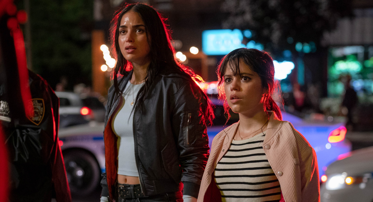
Review: (#1) There isn’t much information given here, especially not why our small town protagonists are in the big city, but there’s just a hint of tension that makes the film look like it might work.
(#2) We get fewer scenes in this second trailer, but no more plot information, which is mystifying. What’s left behind is a trailer that looks like too many other horror trailers and which tries too hard to sell on its past and too little to sell to inventiveness, which is what fans of the series are wanting with its first foray into a big city.
(#3) As is often typical for the final trailer design, a select few critic responses are highlighted and the rest is just action porn without a sense of genuine effort.
Oscar Prospects:
None.
Trailer #1












Leave a Reply