

Page Revisions:
(October 19, 2025) Original
(December 28, 2025) New Trailer (#2)
(January 11, 2026) New Trailer (#3) — New Poster (#2)
(January 25, 2026) New Posters (#3-#5)
Release Date:
January 30, 2026
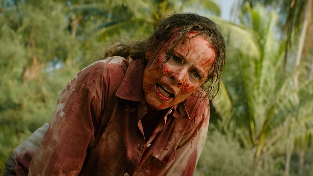
Synopsis:
From IMDb: “Two colleagues become stranded on a deserted island, the only survivors of a plane crash. On the island, they must overcome past grievances and work together to survive, but ultimately, it’s a battle of wills and wits to make it out alive.”
Poster Rating: C+ / C+ / C+ / C / C+
SEE ALL POSTERS BELOW
Review: (#1, C+) This design’s red-and-black background is its biggest failing. It might help the foreground figure stand out but does little to fill up unused space. The idea is simple and it fairly well conveys the film’s premise but could use some help of its own.
(#2, C+) It maintains the mediocrity of the prior design with the same color scheme but darker. It still gets across the concepts of the film even if it looks a bit more amateurish in the process.
(#3, C+) This 4DX design somewhat touches on the premise with the rip through the main image showing the tears of a techbro without the sense of why he’s afraid. (#4, C) A ScreenX effort that’s about as dull as you can get. No sense of excitement, just of setting. Sure, the finger trails in the sand as of someone being dragged away are an interesting affectation, it isn’t enough. (#5, C+) Similar to the third design but going for something a little more visually striking, like something inspired by posters of the 1970s. It has a lot of nice touches and might be interesting if there weren’t so much wasted space in the image.
Trailer Rating: B / C+ / B-
SEE ALL TRAILERS BELOW
Review: (#1, B) You’d be forgiven if you’re reminded a bit of Lost with this trailer but that only occupies a handful of seconds. The rest of the trailer looks like a rather ham-fisted story about turned tables and vengeance against a pathetic “alpha male.” But it’s heavy handed and doesn’t present much in the way of unique vision or intriguing elements. That’s going to keep the film from reaching a broad audience.
(#2, C+) Condensing the first trailer down into a chaotic burst of narrative significance doesn’t make the film look more interesting. Some elements keep the energy going but ultimately it’s a pointless alteration.
(#3, B-) While not as interesting as the opening trailer nor as generic as the second, this one shows off more elements of the film’s plot and does a better job explaining it than the prior. It gives the audience something that might pique their interest while also looking a bit silly.
Oscar Prospects:
None.
Trailer #1
Trailer #2
Trailer #3
Posters
 Poster #1
 Poster #2
 Poster #3
 Poster #4
 Poster #5


Leave a Reply