

Page Revisions:
(February 9, 2025) Original
(April 27, 2025) New Trailer (#2) — New Posters (#9-#10)
(June 8, 2025) New Trailer (#3) — New Posters (#11-#25)
(June 29, 2025) New Trailer (#4) — New Poster (#26)
(July 20, 2025) New Trailers (#5-#6) — New Posters (#27-#50)
Release Date:
July 25, 2025
Synopsis:
From IMDb: “Marvel’s First Family face their most daunting challenge yet. Forced to balance their roles as heroes with the strength of their family bond, they must defend Earth from a ravenous space god called Galactus and his herald, Silver Surfer.”
Poster Rating: B- / C / C / C- / C+ (4) / B / C+ / C / C+ (5) / B- / B / C+ / C / C+ (5) / B- / B (3) / C+ / C+ (5) / C (4) / C / C+ / B (4) / C+ (5)
SEE ALL POSTERS BELOW
Review: (#1, B-) A valentine’s day tease that fits the style and setting of the film. That said, it’s really just the preview image we saw previously with a tacky banner added. (#2, C) a banal design that needs more dynamic movement and detail. (#3, C) Another holiday-related design that punts on its creative energy, giving the viewer a forgettable viewing experience. (#4, C-) While the prior efforts have all seemed to lack a bit of excitement, this design falls even further in terms of its aesthetic appeal with no exciting details to engage the viewer. (#5-#8, C+) These slice-of-life efforts work somewhat well in tandem but don’t work individually. They are simple scenes from the film so a low effort design aesthetic but taken together at least they make some amount of sense.
(#9, B) Although it’s simple, it has the 50s design aesthetic that sets the film’s timeframe. It’s visually striking and showcases how minimalism can work well in poster design. (#10, C+) Simplistic and uneventful, this design certainly sets the time and place of the film but it doesn’t excite in quite the right way.
(#11, C) In the studio’s attempts to capture the essence of the period in which The Fantastic Four is set, they’ve created a series of designs that try to evoke the hero complex that developed around the team. It’s an interesting idea but poorly executed. (#12-#16, C+) Building off the prior design’s concept, these are the trading cards that come from the pack and represent the titular characters. Another interesting idea even if they have some dull execution. (#17, B-) Once again going back to a motif of the artistic style of advertisements of the period, this gorgeously colored design is most compelling and stands out in a sea of overly familiar designs. The background could have used some work but it’s a solid effort. (#18, B) The oppressiveness of the blue coloring keeps this design from soaring. The arrangement of characters and images, building on the feel of the setting make for an interesting effort. (#19, C+) Taking some of the elements of the prior design and dumbing them down for this mediocre effort is disappointing. There’s really nothing here to get excited about. (#20, C) Back to the simplicity of an earlier design without the understanding of when minimalism works. (#21-#25, C+) Format designs that range in styles and competence but stand together as a decent but unexceptional array.
(#26, B-) Employing the same color palette that most of these designs have latched onto, the fitting white-and-blue aesthetic helps the design standout as does its quasi-futuristic 1960s world’s fair concept. All of the major characters are here and they aren’t predictably arranged. It feels a bit washed out but beyond that, it’s solid.
(#27-29, B) This series of format designs fit in with the overall theme of the film while standing out individually from one another. While none of them are shockingly great designs, they are more interesting than those for other films. (#30, C+) A generic design with the four characters but no uniqueness of design or compelling offering. (#31-#35, C+) The 50s aesthetic is well used in these character posters but they are woefully underdeveloped with minimal details and no genuine sense of creative energy. (#36-#39, C) While these are certainly not lazy, the characters look unrealistic, almost cartoonish. While the art isn’t too awful, it’s off-putting enough to be distracting. (#40, C) Another bland effort with a lot of empty space that isn’t effectively filled. (#41, C+) The art is cheaply applied looking like someone just threw in stuff without concern for balance or readability. It’s not awful but it feels tacky. (#42-#45, B) Credit to the designers who took an aesthetic of 1960s advertisements and tied them into the film’s obvious hero-worship concept. These are visually striking even if somewhat empty. They just feel like a part of the world in which they are set and that’s a great optic. (#46-#50, C+) These aren’t too far removed from prior designs or character posters and that lack of inventiveness makes them feel hollow and underwhelming.
Trailer Rating: B / C+ / C / B+ / B / C-
SEE ALL TRAILERS BELOW
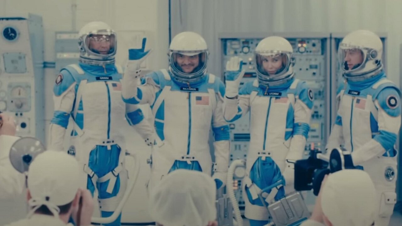
Review: (#1, B) For a first trailer, we get a surprising number of details. While the plot still feels a bit amorphous, it does a good job of setting audience expectations of a hyper-stylized version of 1960s America. That it has some small resemblance to The Incredibles might make one cautious, the end result is rather one of hope for those who weren’t impressed with either of the prior attempts to filmify this comic quartet.
(#2, C+) A full-fledged trailer that sets the stakes and the narrative for the film but still feels a bit hollow and overly familiar. The Marvel polish feels ill-fitting to the setting and tone of this movie and the lack of effective humor may disappoint some fans of the comics. The less said about the terrible makeup job on Pedro Pascal’s graying temples, the better.
(#3, C) A film like this needs some amount of mystery to be compelling. Style and substance aren’t mutually exclusive but this film certainly wants to build upon the former and ignore the latter, perhaps to its own detriment. However, the trailers don’t seem to be presenting much that’s new or enticing and diminish their necessity as a result.
(#4, B+) After a couple of lackluster trailers, the promise of the first trailer finally comes to fruition. This design gives us plenty of action, sets the stakes of the film, and better explains the quasi-futuristic setting, one modeled after the future posited in the 1960s. It has a Jetsons-like quality that might help it resonate with Gen X audiences who are still a major force in cinematic success.
(#5, B) Lots of action, a little bit of humor, and more details about the plot. It isn’t better than the trailer immediately proceeding but at least it justifies its own existence.
(#6, C-) Unlike this trailer, which takes a single scene from the trailer, throws in a reference scene, and ultimately distills the entire film down into a sound bite. It’s an unnecessary effort that gives away a bit too much about the film’s plot and potentially key twist.
Oscar Prospects:
It’s not often a Marvel movie places itself into the past. The last one didn’t do well, so this one may not either. If anything, Production Design, Costume Design, Sound, and Visual Effects are possibilities.
Trailer #1
Trailer #2
Trailer #3
Trailer #4
Trailer #5
Trailer #6
Posters
 Poster #1
 Poster #2
 Poster #3
 Poster #4
 Poster #5
 Poster #6
 Poster #7
 Poster #8
 Poster #9
 Poster #10
 Poster #11
 Poster #12
 Poster #13
 Poster #14
 Poster #15
 Poster #16
 Poster #17
 Poster #18
 Poster #19
 Poster #20
 Poster #21
 Poster #22
 Poster #23
 Poster #24
 Poster #25
 Poster #26
 Poster #27
 Poster #28
 Poster #29
 Poster #30
 Poster #31
 Poster #32
 Poster #33
 Poster #34
 Poster #35
 Poster #36
 Poster #37
 Poster #38
 Poster #39
 Poster #40
 Poster #41
 Poster #42
 Poster #43
 Poster #45
 Poster #45
 Poster #46
 Poster #47
 Poster #48
 Poster #49
 Poster #50


Leave a Reply