

Page Revisions:
(September 29, 2024) Original
(March 16, 2025) New Trailer (#2) — New Posters (#2-#3)
(April 20, 2025) New Trailer (#3) — New Posters (#4-#19)
(April 27, 2025) New Posters (#20-#28)
(May 4, 2025) New Trailer (#4)
Release Date:
May 2, 2025
Synopsis:
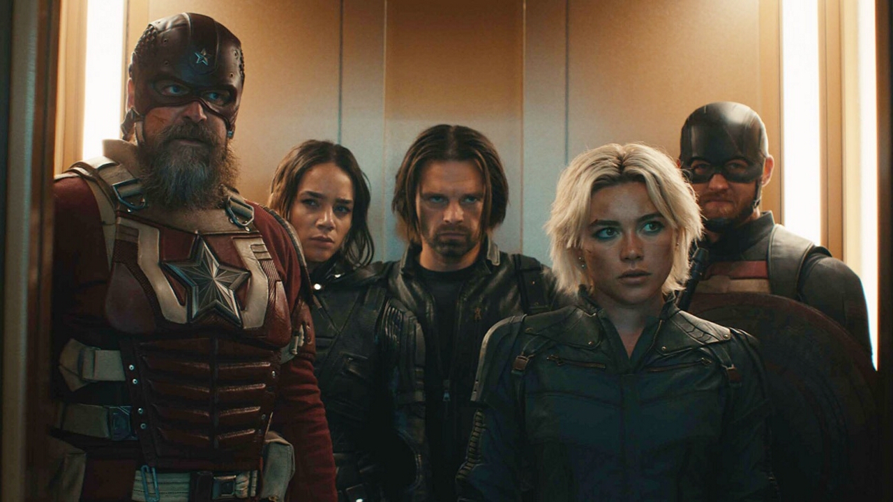
From IMDb: “A group of supervillains are recruited to go on missions for the government.”
Poster Rating: C+ / C+ / B- / C (6) / C / C / C+ / B- / C / C / C / C+ / C / C- / B / B- (2) / C (6)
SEE ALL POSTERS BELOW
Review: (#1, C+) While there’s something fairly rote about the design, the creators at least understand the assignment of pitting these various figures, some familiar to Marvel fans, against one another. If the design had more intriguing details, it might have been more exciting.
(#2, C+) It’s an unusual choice to put these characters into a design that is reminiscent of the Wheaties box. The film seems to be trying to lean into cheekiness and this is probably part of the reason why but it doesn’t make a whole lot of sense. (#3, B-) Although this design is simplistic, it’s compelling. Using the asterisk that follows the title (which is finally given definition saying that The Avengers aren’t available at the bottom of the design) as a design choice is a bold one and it’s compellingly used. That Bob isn’t given his own spoke speaks to his status as an afterthought in the film itself, a comedic element. It reminds of the use of Peter in Deadpool 2. Anyway, it’s a more intriguing and unique design than what they’ve come up with before.
(#4-#9, C) Characters against a destructive backdrop. That gives them some depth and differences in locales but they never look unique or compelling. (#10, C) The character poster figures haphazardly stacked together. The title area is distinctly dull. (#11, C) Back to the yellow motif that made prior designs work but not this one. There’s a lack of detail that doesn’t add anything of intrigue to the central image. (#12, C+) A better balanced effort with the characters stacking together well but with no compelling background details and a distinct lack of interest. (#13, B-) In comparison to the prior designs, these are unique and interesting with color schemes that texture and depth with an interesting dual-nature to each character that one finds compelling. That lack of background elements is a downside.
(#14, C) Another lackluster asterisk motif with a lot of empty space and too-tiny figures at the top. (#15, C) Like Florence Pugh’s character looking bored, this design conjures up the same boredom. Half of it is inundated with simplistic colors and unimpressive details while the top half doesn’t feel natural fitting. (#16, C) The array of characters is better handled than the prior design but there’s insufficient detail to add some interesting effects. (#17, C+) A better setting for the backdrop with more naturalistic elements but it still has the feeling of being poorly combined and ill-fitting. (#18, C) With a slightly more rich golden-yellow glow, the design lacks details and none of it makes the design shine. (#19, C-) The lowest of efforts looks like it was put into this design. There’s a limited feeling of depth, uninteresting colors, and no sense of purpose.
(#20, B) The rough part of this design is the attempt to make the figures being looked down at from above. Not all of the arms look naturally posed but it doesn’t hurt the design too much with its intriguing attempt at thematic reference. (#21-#22, B-) The art is unimpressive, but the idea is at least amusing. It’s nice to see designers having a little bit of fun with their efforts. The only real problem is putting the bigger name actors on one design and the lesser on other. It creates an odd imbalance. (#23-#28) A mediocre batch of character posters. Although the yellow-and-black color scheme often works well together, the white notes are off-putting. The figures are set into a lifeless background but are tackled at oblique angles that show a desire to try something new.
Trailer Rating: C+ / C+ / B+ / D+
SEE ALL TRAILERS BELOW
Review: (#1, C+) The trailer consists mostly of set-up material, establishing that this is a film that pulls in various figures from past Marvel properties, some on screen, some on streaming. While the interpersonal conflicts of these characters are briefly referenced, it seems like the trailer makers aren’t sure where to go with it. This trailer almost makes this seem like a terrestrial version of Guardians of the Galaxy and making a connection like that without feeling unique to itself won’t draw many viewers.
(#2, C+) The first trailer tried to establish the plot of the film and that gave viewers some hope for some uniqueness. However, this second trailer avoids that information almost entirely and tries to make it look exactly like every other MCU film. That might not be the best way to approach it considering how the recent films have all tanked with audiences. There’s some glimmer of hope on the edges of the trailer but its similarity to The Suicide Squad dashes some of it.
(#3, B+) The first two trailers made the film feel like Marvel’s answer to Suicide Squad but this trailer makes it look like something wholly different. These misfits are trying to find purpose and redemption and that kind of story arc has a certain appeal. The narrative is more strongly presented and the end result is something that looks entirely unique to this particular universe.
(#4, D+) This all-too-short “tickets available” teaser is depressingly dull and while the character they highlight is one we haven’t seen much about, it doesn’t give us enough to sink our teeth into.
Oscar Prospects:
None.
Trailer #1
Trailer #2
Trailer #3
Trailer #4
Posters
 Poster #1
 Poster #2
 Poster #3
 Poster #4
 Poster #5
 Poster #6
 Poster #7
 Poster #8
 Poster #9
 Poster #10
 Poster #11
 Poster #12
 Poster #13
 Poster #14
 Poster #15
 Poster #16
 Poster #17
 Poster #18
 Poster #19
 Poster #20
 Poster #21
 Poster #22
 Poster #23
 Poster #24
 Poster #25
 Poster #26
 Poster #27
 Poster #28


Leave a Reply