

Page Revisions:
(December 21, 2025) Original
(April 19, 2026) New Trailer (#2)
(September 6, 2026) New Trailer (#3) — New Posters (#18-#21)
(October 11, 2026) New Posters (#22-#34)
(October 18, 2026) New Poster (#35)
Release Date:
October 16, 2026
Synopsis:
From IMDb: “Street Fighters Ryu and Ken reunite when Chun-Li recruits them for the World Warrior Tournament. As they face a hidden conspiracy, they must confront each other and their past-or face destruction.”
Poster Rating: B- (17) / B- (2) / C / C+ / B- / C (2) / C+ / C / B / C / B / C+ / C / B / B- / C / B-
SEE ALL POSTERS BELOW
Review: (#1-#17, B-) Releasing character posters before your final design makes some amount of sense for a film like this, one with a vast stable of prominent characters, many of whom fans of the video game Street Fighter will be excited to review and determine if the film lives up to expectations or not. Unique colors and poses for each are hampered by the lack of background details and the difficult lettering to parse.
(#18-#19, B-) Presumably, this pair of posters splits the good-aligned characters from the evil-aligned but it won’t make sense to non-fans. That said, the only people likely to turn out to this movie are fans, so it works well enough. (#20, C) This design effort looks like it was born of an attempt to create two mirrored images but there’s no evidence there’s a contrasting design for the right-hand side. Then, with the limited detail of the backdrop, the space is poorly used even if largely full. (#21, C+) Pulling in several familiar characters without including all of them seems like an effort to limit the design to people important to the story but simultaneously avoids a potentially epic poster design featuring the full roster.
(#22, B-) Feeling modestly like a design from the 1980s/1990s, this poster has little going on for looking like it has so much. The characters are difficult to separate from their surroundings and the modest affectations only create chaos not succinctness. (#23-#24, C) While a step above the standard IMAX design, the effort is generic albeit colorful. The same can be said of the 4DX design as well but less colorful. (#25, C+) Another incomplete design that looks to be part of a pair of efforts and might have been more interesting had it been designed with a second poster at a diagonal position. (#26, C) Back to the mediocrity with a Dolby design overly focused on dichromatic blandness. (#27, B) Were this solely an effort designed to look like a faded video store box that sat in direct sunline for too long, it might have been more effective than the e3nd result, which has elements that aren’t faded and is capped by a bland white section on its left. (#28, C) It’s interesting that the blood drips on the gloves are coming from nowhere while the rain is failing to leave dampness on either glove. (#29, B) A well balanced stack of characters with each standing apart distinctively while allowing the faded colors to stand out appealingly. The empty backdrop needs some flavor but it’s otherwise a solid design. (#30, C+) The overuse of red and yellow makes for a burning aesthetic that ends up blending together with its various elements, especially the M. Bison figure looming large in the background. The barely distinguishable figures at the bottom of the central image add little, especially when one of them is the aforementioned villain. (#31, C) Another failed Dolby design with very little background detail, an admittedly fitting logo, but is an otherwise forgettable effort. (#32, B) Credit for trying something new even if it is difficult to look at in the whole. The red, black, and yellow background makes it more difficult to parse but the arrangement of figures gives everyone their due. (#33, B-) Back to the faded video store cover concept from a prior effort, this one features an unnecessary amount of white in the background. (#34, C) Just like the aforementioned Dolby design, this IMAX effort doesn’t have enough in terms of appealing content.
(#35, B-) There isn’t much to say about this design that wasn’t said when the original set of 17 character posters was released. See my comments on #1-#17 above.
Trailer Rating: B- / C / B
SEE ALL TRAILERS BELOW
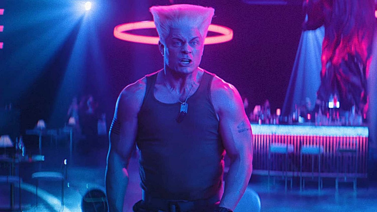
Review: (#1, B-) A collection of moments featuring the 90s pastiche that is Street Fighter will likely appeal to those kids who put hours into this video game either in arcades or on the small screen. There’s not enough premise available in the trailer to indicate whether the story will be interesting but nostalgia is crucial for getting this one off the ground.
(#2, C) With two of the 1990s most iconic fighting games coming to theaters in 2026, it’s imperative that they tie themselves in with nostalgia and excitement to make the efforts look worthwhile. Street Fighter is the only one of the two that is struggling. It’s tongue-in-cheek style looks cheaply cheesy rather than excitingly cheesy. The narrative is a bit weak and while the rivals-as-friends concept feels overplayed almost instantly, that’s where the film seems to distinguish itself a bit even if not terribly successfully.
(#3, B) A surprisingly lengthy trailer that does a lot of heavy lifting when identifying the narrative but features plenty of fighting concepts drawn directly from the game, which should generate a lot of appeal in the minds of Gen X, who is clearly the target of this particular video game transfer. It also suggests the film has very limited plot possibilities.
Oscar Prospects:
None.
Trailer #1
Trailer #2
Trailer #3
Posters
 Poster #1
 Poster #2
 Poster #3
 Poster #4
 Poster #5
 Poster #6
 Poster #7
 Poster #8
 Poster #9
 Poster #10
 Poster #11
 Poster #12
 Poster #13
 Poster #14
 Poster #15
 Poster #16
 Poster #17
 Poster #18
 Poster #19
 Poster #20
 Poster #21
 Poster #22
 Poster #23
 Poster #24
 Poster #25
 Poster #26
 Poster #27
 Poster #28
 Poster #29
 Poster #30
 Poster #31
 Poster #32
 Poster #33
 Poster #34
 Poster #35



















Leave a Reply